Before After Collage Maker: A Service Business Owner's Honest Take on the Collage Trend
Three years ago I spent two hours on a Saturday trying to build a four-panel collage of a full house wash we'd done in Ada, Michigan. I wanted front of house, back of house, side wall, and gutter close-up — all in one shareable image. By the time I'd fought through a before after collage maker that wanted a Pro subscription for a 2x2 grid, I'd burned the afternoon and posted nothing. That's how I learned the difference between a tool built for service businesses and a tool built for someone else.
What is a before after collage maker?
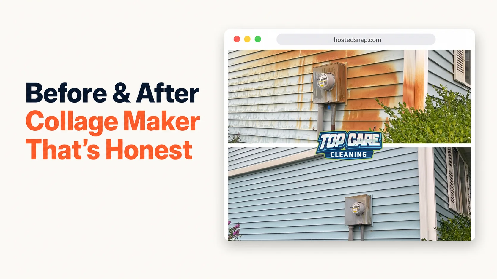
A before after collage maker is a web or app-based tool that arranges multiple before-and-after photos — typically 2, 3, or 4 panels — into a single shareable image. Unlike a basic side-by-side tool that handles exactly two photos, a collage maker lets you show the full story of a job: multiple surfaces, multiple angles, or multiple rooms in one post. Good ones are honest-free and output at posting resolution.
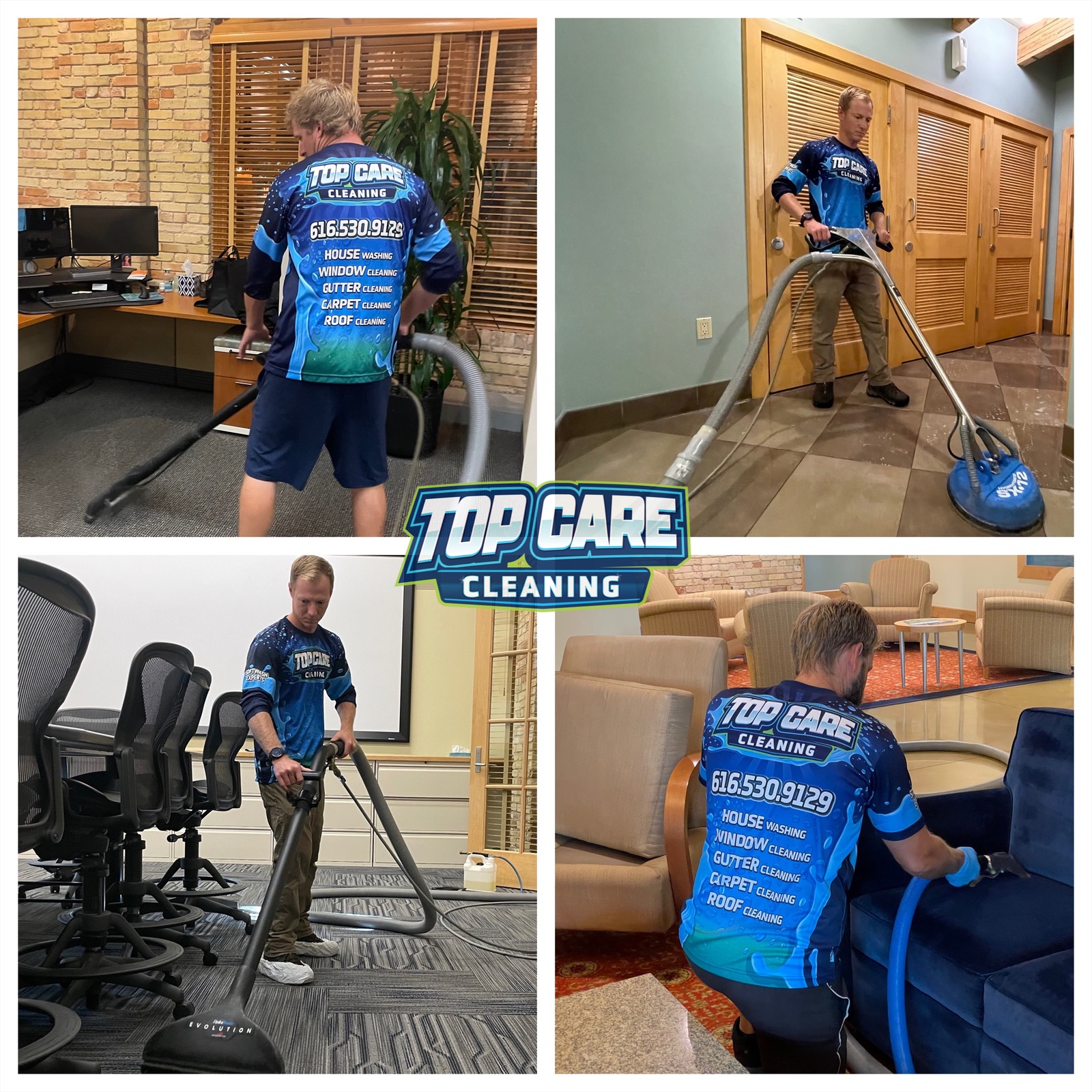 A montage of Top Care Cleaning technicians on jobs across Grand Rapids, MI — the same multi-panel logic that powers a good before-after collage.
The Difference Between a Side-By-Side and a True Collage
Most people searching for a before after collage maker actually want two different things and don't know which one yet. It's worth being precise about the distinction before you pick a tool or a format.
A side by side photo is exactly two photos joined into one frame with a single divider. Before on the left, after on the right. It's the workhorse format for a single-surface transformation — one driveway, one gutter run, one window. The comparison is binary and immediately legible on a phone screen.
A collage is 3 or more photos arranged in a grid. The classic layouts for service businesses are a 3-panel strip (horizontal or vertical), a 2x2 four-panel grid, or an asymmetric 1-big-2-small layout. The collage tells a richer story, but it asks more of the viewer's attention.
When a collage earns its complexity
A collage earns its extra panels when one photo genuinely can't tell the story. Examples I've run into at Top Care Cleaning in Grand Rapids, MI:
A full house wash job where we soft-washed the front, the back gable, and the side wall with heavy algae growth. Three before photos, three after photos — a 2x2 or 3-panel before after collage maker is the right tool. A single side-by-side would pick one surface and throw away the other two transformations.
A gutter cleaning job that also included a roof moss treatment. We had gutter close-up before/after, roof line before/after, and a downspout flush shot. A three-panel collage let us post all three proof points to Google Business Profile in one image.
A carpet cleaning recap covering three rooms in the same house. Room-by-room documentation is more compelling than a single hallway carpet shot. A 2x2 grid — living room, dining room, staircase, master bedroom — makes the scope of the work legible.
When a collage hurts instead of helps
The honest version of this article has to say: most of the time, a collage is the wrong format for a service business posting on social media. Here's why.
On a phone screen, each panel of a 2x2 collage renders at roughly a quarter of the screen width. Four thumbnail-sized photos of a house wash do less work than one sharp, full-width before-and-after of the same house wash. The viewer's eye has four places to go and no clear starting point.
More panels also means more things that can go wrong. Mismatched lighting across panels is the main killer — if your before photos were shot at 8am and your after photos at 2pm, a four-panel grid makes that inconsistency glaring. A side-by-side hides it better because there's only one comparison seam.
The rule I've landed on at Top Care: use a collage when the job had multiple distinct surfaces worth documenting AND you're posting to a platform that renders multi-panel images at adequate size. Google Business Profile, your website, and Facebook desktop all work. Instagram phone feed is risky. Nextdoor on a small phone screen is borderline.
The 2x2 Grid: The Sweet Spot for Service-Business Proof Posts
Of the collage formats available in any before after collage maker, the 2x2 four-panel grid is the most practical for service businesses. Here's why it works and why the other formats fall short more often.
The 2x2 grid is visually symmetrical. Your eye moves in a Z-pattern — top-left, top-right, bottom-left, bottom-right — which is the same natural reading order of any square content. The viewer's brain doesn't have to work out which panel comes next.
It fits the square crop preferred by Google Business Profile and Instagram feed without letterboxing any individual panel. Each panel is a 1:2 rectangle inside a 1:1 square output. Phone cameras shoot 4:3, so you'll lose a little edge on each photo, but not enough to drop important content.
The two-and-two structure maps naturally to a before/after story with two surfaces. Top row: front of house before and after. Bottom row: back gutter before and after. The viewer reads the transformation on two surfaces in one image.
When 3-panel strips are better
A 3-panel horizontal strip works when you have three sequential stages rather than two surfaces. The best example from our work: a roof soft-wash where we show the original moss growth, the treatment applied (cleaning foam visible on the roof), and the finished cleaned surface. Three stages read left to right. The 3-panel strip is the right layout for that story.
The 3-panel format also works for before-during-after documentation in trades where the process is impressive on its own — a plumber showing pipe condition, the repair in progress, and the finished connection. The strip reads like a visual sentence.
Why more than four panels almost always fails
I've seen service businesses try to post 6-panel and 8-panel collages. On a desktop monitor they look fine. On a phone they look like a grid of postage stamps. The individual panels are too small to register any detail. The whole image reads as "busy" rather than "proof."
The practical upper limit for a service-business social post is four panels. If your job genuinely produced more than four distinct documentation shots worth sharing, pick the four strongest ones and save the rest for your website gallery.
Collage Mistakes Specific to the Multi-Panel Format
A before and after photo maker that handles two photos masks certain mistakes automatically — there's only one comparison seam to get right. A collage has multiple seams, multiple lighting conditions, and multiple composition decisions. The failure modes multiply.
Mistake 1: Mismatched lighting across panels
This is the single biggest collage killer. Panel one shot at dawn, panel two shot at midday, panel three shot at dusk — the grid looks like four different jobs. The viewer's first instinct isn't "impressive transformation," it's "these aren't all from the same job."
The fix is to shoot all before photos in the same lighting block and all after photos in the same lighting block. At Top Care we tell techs: take all the before shots within the first ten minutes on-site. Take all the after shots within the last ten minutes. Don't mix morning and afternoon shots in the same collage.
Mistake 2: Overstuffed panels with no visual hierarchy
Four panels of equal size with no anchor image look like a contact sheet. The viewer doesn't know where to start. The fix is simple: if your collage tool allows it, make one panel slightly larger — the primary transformation, the most dramatic before-and-after — and let the other three panels support it.
Not every before after collage app supports variable panel sizing. If yours doesn't, accept the symmetric grid and compensate with shot selection: pick photos where the most dramatic transformation is the top-left panel, because that's where the eye lands first.
Mistake 3: Dead space in a panel
A panel where the subject is a small object centered in a lot of sky or lawn looks like a mistake. Every panel needs to fill its frame. A gutter close-up that shows three inches of gutter and two feet of siding is wasted real estate. Crop each source photo tight before you drop it into the collage tool.
Mistake 4: Mixing portrait and landscape orientations
A collage that tries to combine vertical photos and horizontal photos in the same grid produces inconsistent panel dimensions and awkward white fill. Pick one orientation for all source photos before you start building the collage. Portrait orientation works better for 2x2 grids on phone screens. Landscape works better for 3-panel horizontal strips.
Mistake 5: Using the collage as a workaround for weak individual photos
A collage doesn't rescue four mediocre photos. If the individual before-and-after comparison in each panel isn't compelling on its own, four of them in a grid just produces four times the mediocrity. The test: look at each panel as a standalone two-photo comparison. If any single panel wouldn't earn a post on its own, reshoot it or drop it.
How to Build a Collage That Actually Works (The Top Care Workflow)
I've run this workflow at Top Care Cleaning for jobs that genuinely earn multi-panel documentation. The tool has to handle the job; the workflow is the other half.
Step 1: Decide the layout before you shoot
This is the discipline most service businesses skip. Before the tech starts the job, decide: is this a 2x2 job or a side-by-side job? For a single-surface clean, it's a side-by-side. For a multi-surface or multi-stage job, pick the layout (2x2, 3-panel strip) before the camera comes out.
Knowing the layout in advance tells the tech exactly how many before shots to take and from what angles. A 2x2 grid needs exactly two before shots and two after shots. A 3-panel strip needs three shots. Don't shoot eight photos and try to edit down to a collage later — you'll spend twenty minutes picking and cropping instead of two minutes posting.
Step 2: Batch your before shots, then batch your after shots
All before shots first, in the same lighting, from the same distances. All after shots last, matching the same angles. Don't interleave them. This is the discipline that eliminates mismatched lighting before it starts.
Step 3: Open a before after collage maker that doesn't add steps
Use a tool that shows you the grid layout immediately when you open it. Not a design suite where the collage template is buried under stickers and brand kits. A before and after picture maker interface that opens to a grid layout is what you want.
Drop in the photos in reading order: top-left before, top-right after, bottom-left before, bottom-right after (for a 2x2 with two surfaces). Or left-to-right in sequence for a 3-panel strip.
Step 4: Check each panel for crop and dead space
Zoom into each panel before you export. Is the main subject filling the frame? Is there awkward dead space? If yes, go back and crop the source photo tighter. Don't try to crop inside the collage tool — most tools do this poorly, and it's faster to fix the source photo.
Step 5: Export at native resolution and post
Download at the highest resolution the tool offers. A 2x2 collage at 1200 × 1200 total pixels gives you 600 × 600 per panel — marginal for Google Business Profile's 720 × 720 recommendation. Aim for 2400 × 2400 output if your tool supports it, which gives each panel 1200 × 1200. If the tool only exports at 1200 × 1200 for free and asks you to upgrade for higher resolution, that's the influencer-tool-priced-for-influencers pattern. Find another tool.
Where Collages Fit in a Service-Business Posting Cadence
A collage takes more time to produce than a side-by-side. The return has to justify the time.
My honest answer after four years: use a collage once a month, not once a week. The weekly posting cadence for Google Business Profile runs best on how to make a before and after photo that takes under two minutes — fast, consistent, single-surface proof. The monthly collage is the "full job recap" post — the one where you documented everything and want to show scope.
The monthly collage also earns a longer caption. The weekly side-by-side caption is one sentence. The monthly collage caption can run three to four sentences: service description, location, scope of work, and a trust line. The viewer who stops on a four-panel collage is already more engaged than the viewer who just scrolled past a single side-by-side.
For Facebook specifically, collages outperform side-by-sides on engagement when the job was a full-property recap. Facebook's feed renders multi-photo posts larger than GBP does, and the platform's audience skews toward homeowners already primed to spend on exterior cleaning. A four-panel house wash collage captioned "Full exterior day in Forest Hills — house wash, gutter clean, soft-wash roof" hits all three of their decision triggers in one scroll stop.
Common Questions
What is the best layout for a before after collage for a service business?
The 2x2 four-panel grid is the most practical for jobs with two distinct surfaces. A 3-panel horizontal strip is better for before-during-after sequences. For a single-surface job, skip the collage entirely and use a side-by-side — one comparison seam, maximum panel size, faster to make.
How many photos should a collage have?
Four is the practical upper limit for a social media post. On phone screens, panels smaller than 600 × 600 pixels stop registering as legible before-and-afters. If you have more than four documentation shots worth sharing, use four for the post and upload the rest to your Google Business Profile photo gallery separately.
Does a before after collage app require a subscription?
Most collage apps in the market are structured as freemium: free tier with watermark or low-resolution export, paid tier from $9-29/month to remove restrictions. The honest-free category (no watermark, no signup wall, no influencer-tier subscription) is smaller but exists. That's the category worth starting in.
Can I make a collage on my phone?
Yes. Any browser-based collage tool works on a phone browser. Native apps are available too, though many use the in-app purchase model to gate the 2x2 grid behind a $4.99-$9.99 one-time fee. Browser-based tools are easier to deploy across a team of techs — no install, no version conflicts, everyone uses the same workflow.
What resolution should I export at?
Aim for 2400 × 2400 minimum for a 2x2 grid. That gives each panel 1200 × 1200 pixels, which clears Google Business Profile's 720 × 720 minimum with room to spare. If the tool only offers 1200 × 1200 total for free and charges for higher resolution, the tool is using the deceptive-UI pattern. Move on.
Should I add "Before" and "After" labels to each panel?
For obvious transformations, labels are optional. For panels where the before and after are subtle — window cleaning, interior carpet cleaning, attic insulation — small corner labels ("Before," "After") help the viewer orient. Keep them small and low-contrast. They should confirm the comparison, not dominate the image.
How do I make sure the panels look like they're from the same job?
Consistent lighting (same time of day for all before shots, same time of day for all after shots) is 80% of the answer. Consistent distance and angle is the other 20%. If both of those are right, the four panels will look like a cohesive grid, not a random selection of job photos.
Is a collage better than a side-by-side for Google Business Profile?
Not automatically. For a single-surface job, the side-by-side wins because the comparison fills more of the screen. For a multi-surface job where the scope of work is the selling point, the collage wins because it documents every surface. Match the format to the job, not the other way around.
I Built Hosted Snap Because a Collage Shouldn't Require a Pro Account
I built Hosted Snap because I was losing time to tools that treated a 2x2 grid as a premium feature. The case for a before after collage maker that's honest-free isn't complicated: service businesses take the photos already. The tool just has to combine them without charging influencer prices for a two-minute task.
The pattern I kept hitting was a freight-train-to-deliver-a-pizza: sign up, confirm email, land on a dashboard with 40 features, find the collage template buried under brand kits and social calendars, hit export, get a watermark-on-your-own-work prompt, upgrade for $19/month. That's not a tool built for a cleaning business owner making a post from the truck before driving to the next job.
Hosted Snap is built for that truck. Fast, free, honest pricing, no watermark. Pick your layout, drop in the photos, download, post, drive.
About Alex Host
I'm Alex Host. I run marketing for Top Care Cleaning — my family's pressure-washing and exterior-cleaning business in Grand Rapids, Michigan, started by my dad and uncle in 1980. Four hundred-plus Google reviews. Forty-five years of customer work.
Alongside Top Care, I build software at Hosted Brands — the parent company behind Hosted Snap (the free tool you're reading about), Hosted Reviews, Hosted Proof, and the rest of the Hosted Stack. Everything I build is the tool I wished I'd had at Top Care five years ago.
Hosted Snap is free forever. No signup. No watermark. No upsell. It exists because the alternatives kept failing the five-job test — and a before after collage maker that charges for a 2x2 grid is just one more tool that failed it.